Hi there! 
I am still new here, with around 20 exercises completed. I just started getting code reviews for exercises in Unison.
I find it hard to find my code reviews:
-
For the on going ones, I need to go to the corresponding language track and scroll down. So, I dont see it instantly and may forget to check on them.
-
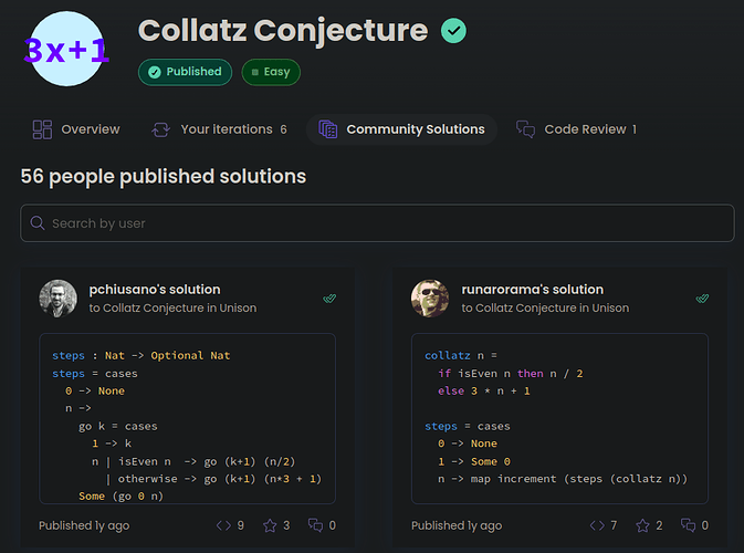
For the ended ones, it is even harder. I need to find the exercise it was linked to, which means I need to go into the Exercises tab and look for the exercises with the ended code review icon. And then go to the Code Review tab and open the code review. That last part is not really a problem… but it could be if for some reason I have multiple code reviews for the same exercise, since thew have no title or preview.
I recently unlocked the Mentoring page and it’s great! It regroups everything. One can easily check the mentoring sessions depending on there state.
I feel like a similar page should exist for the code reviews, where I could find them all, filter by state, langage, (mentor ?, search words in conversations ?)… And that this page should be well visible on the home dashboard.
As always, I am opened to feedback and ideas about this! 
1 Like
Welcome to Exercism!
If I understand you correctly, you want something like the mentoring tab - which is for the sessions you mentor - for sessions you’re mentored in. I like the idea!
EDIT: You might like to check out this forum thread about improving the mentoring experience. Not directly related, though. I mentioned your first point in that thread, and feel that this feature potentially will help in that problem. What does everyone else think?
1 Like
I agree there is a problem, @Adrien-ANTON-LUDWIG.
A workaround: via the «Solutions» tab on the Journey page.
1 Like
And? There doesn’t seem to be a link to go to the review session. But you can filter it, yes.
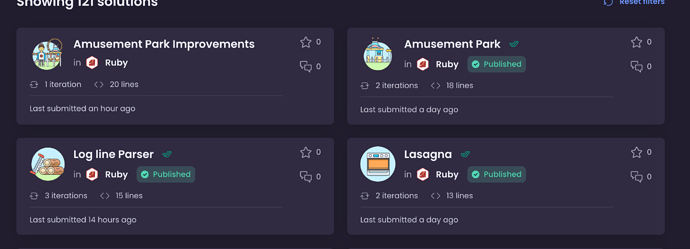
I’m not sure if it’s a bug, but all the numbers next to the comments icon say 0, even though I’ve had review sessions in all of these exercises.
Thank you @MatthijsBlom, I did not know about the filtering possibilities of this page!
Like you said, it can act as a workaround but it is still doesn’t cover some points like being visible on the main dashboard to encourage students to respond. Which I feel is big point of concern reading the thread that @safwansamsudeen pointed above or even this thread about renaming “mentoring” to “code review”.
I think the message icon is for comments.
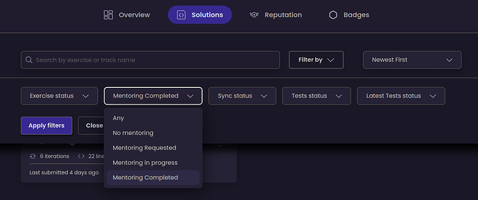
You can filter by mentoring status like this:
Which helps but is not quite there yet.
Ah OK.
It’d be nice if there was something about the review session, like you say.
Yes!
I was going to say “as the icon of the track exercises tab” but…

…it seems to be the same as the comment one. 
![]()
![]()


