AI isn’t legal counsel 
Does this mean it conflicts with the repo license?
It might be best to avoid AI generated content to avoid licensing complications.
AI isn’t legal counsel
Does this mean it conflicts with the repo license?
It might be best to avoid AI generated content to avoid licensing complications.
Another thing to watch out for is that the graphic will need to either have a light version and dark version, or be invertible. Otherwise, it won’t display correctly for folx using dark (or light) theme.
Can I do that with python matplotlib?
Yes, in the sense that you can apply a dark vs light colorway before saving out two files. I would have to look up if you can actually export an invertible SVG. Hold, plz. 
I can get plain python code and generate it myself to cut out the middle-ai
From a quick search, no. But there things like GitHub - lmammino/svg-invert: CLI utility and a library to invert colors in an SVG image, which can do a fast and dirty inversion from SVG. But also fairly easy to just use a different colorway in matplotlib, then save out as SVG.
Python’s simple linked list has an SVG that uses middle colors and a transparent background … but I don’t think it works quite as well as two different images with better tuned contrast.
OK, I’ve got some files uploaded: https://glennj.github.io/prism/
As to where to store it, I see other exercises use assets.exercism.org (for example Darts). I suppose that would require Jeremy to put files there.
Eric might have permissions to upload there. Its been long enough that I can’t remember. I know we used to use GitHub, but now use a CDN.
Pull request to the images repo, eg images/images/exercises/killer-sudoku-helper/example1.png at main · exercism/images · GitHub
I know I’m a little late, but I would like to know if I need to do anything or if you have sorted it out yourselves.
I also used matplotlib to run the tests, which was very useful.
Updated the images for transparency. Refreshed page at https://glennj.github.io/prism/
Good enough to PR into the exercism/images repo?
https://glennj.github.io/prism/laser_path-dark.svg doesn’t have visible labels in Chrome.
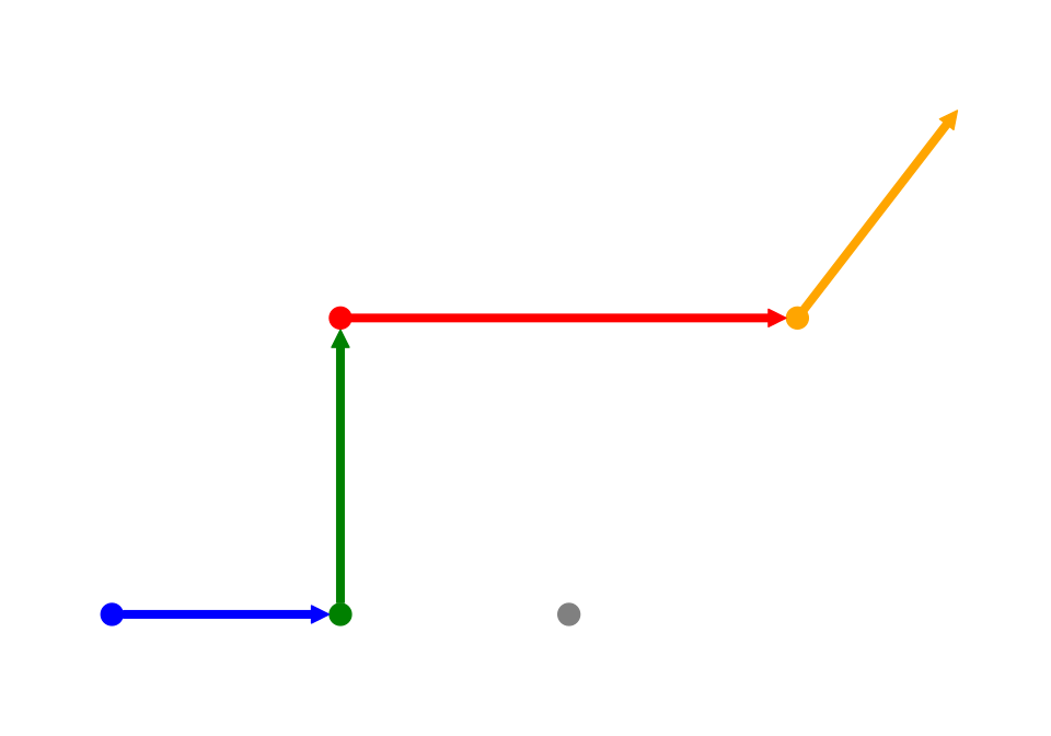
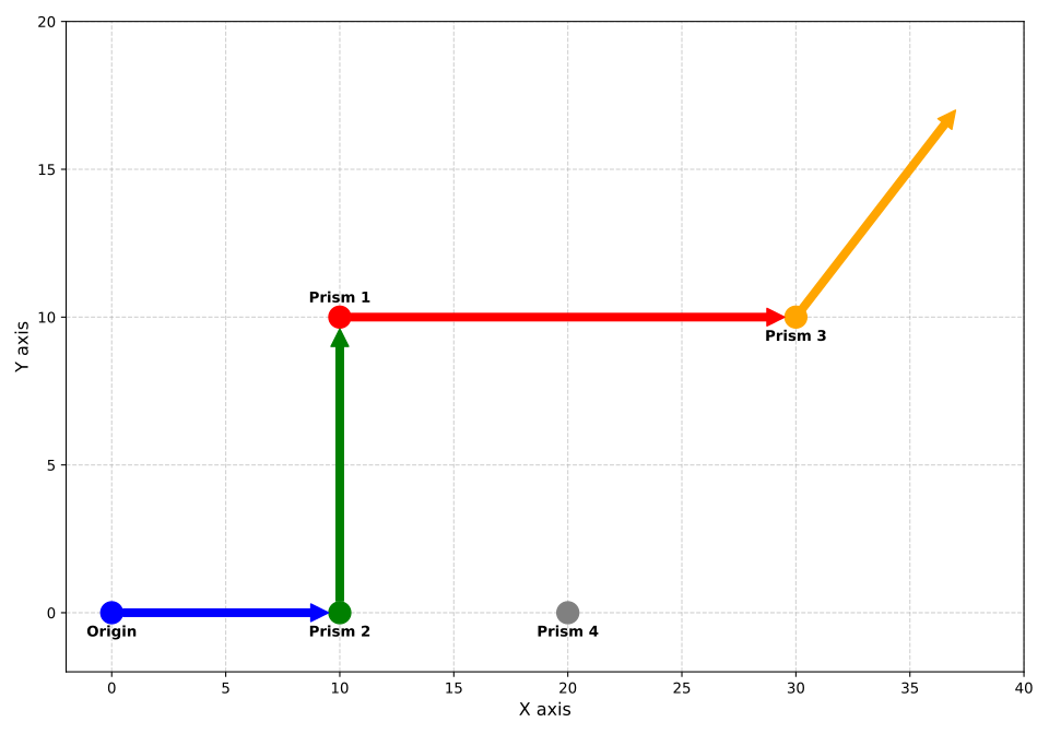
https://glennj.github.io/prism/laser_path-light.svg looks good, but the prism labels are behind the colored paths (see prisms 2 and 3).
My personal preference would be that the prism dots be a different color if possible. The path between prisms 1 & 3 are also red so the prisms are less emphasized than in other spots. Perhaps the prism dot layer can be moved on top of the paths like the text labels. That makes the dots prominent but you still see the connecting paths.
That’s because it’s white text in a transparent image on a white background. You’ll notice the labels are visible against the background of the github.io page.
Looks good to me … though we may not be your reviewer pool for that :)
It would be better if the X and Y axes were the same length. Right now it’s hard to tell at a glance that those “rectangles” are actually squares.
Excellent feedback.
As a colourblind person, the colour of things really takes a backseat.
Would a “hollow” prism make sense? So a  (of any color - doesn’t have to be red) instead of
  ?
?
I also think that each origin → destination should match in color. So blue origin → to blue destination (arrow), then red, then yellow and so on. But that’s a personal prefrence,
Another thought is to make the lines thicker, and distinguish paths with line type, rather than color:
I’m inclined to think the only arrow we need is the orange one to show that both the laser continues for an unspecified distance and that Prism 3 is the last prism hit. From there, a student can logically work out that we start at the origin, go to prism 2, then prism 1, and then prism 3. The other arrows aren’t needed to show the direction because the laser never branches.
However, I’d also be fine with the prism matching the color of the arrow coming off it. I think you’d still want to stack the prism on top of the preceding arrow for visibility’s sake.
Also an option. Then you could make the prism dots larger since you won’t obscure the arrows. For line style, it’d nice to have one solid line because it shows we’re refracting the laser in one continuous movement through the prisms. A dotted line might make folks think there’s a loss in strength as the laser passes the prisms or that it’s not the same laser being passed through the prisms, but the instructions don’t support that conclusion.
Hey all, finally have a bit of time to get back to it. I moved the labels out of the way, and the arrow and point colors are matched.
Please have another look: https://glennj.github.io/prism/