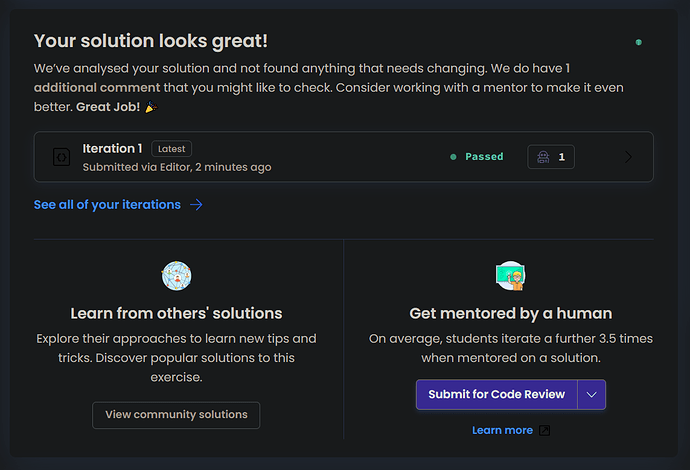
In four weeks I have had 8–10 students who overlooked the Dig Deeper tab. (2 of them spotted it shortly after requesting mentoring.) It feels to me like the Dig Deeper tab (and possibly the Community Solutions tab as well) could use some visual emphasis. A one-time animation following first submission perhaps, or glorious borders?
Also, it seems a suggestion of looking at the approach documents is missing here:
