Hey there, I just noticed that the highlighted entries in the doc navbar have bad contrast in the dark theme.
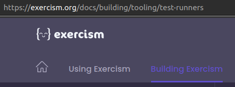
Comes out with a contrast ratio of 1.48
Maybe we can improve this?
Hey there, I just noticed that the highlighted entries in the doc navbar have bad contrast in the dark theme.
Comes out with a contrast ratio of 1.48
Maybe we can improve this?
The contrast of the non-highlighted entries appears to be low as well (3.72). Should be at least 4.5