Post ideas about making the solution page (once you complete a solution) more interesting…
1 Like
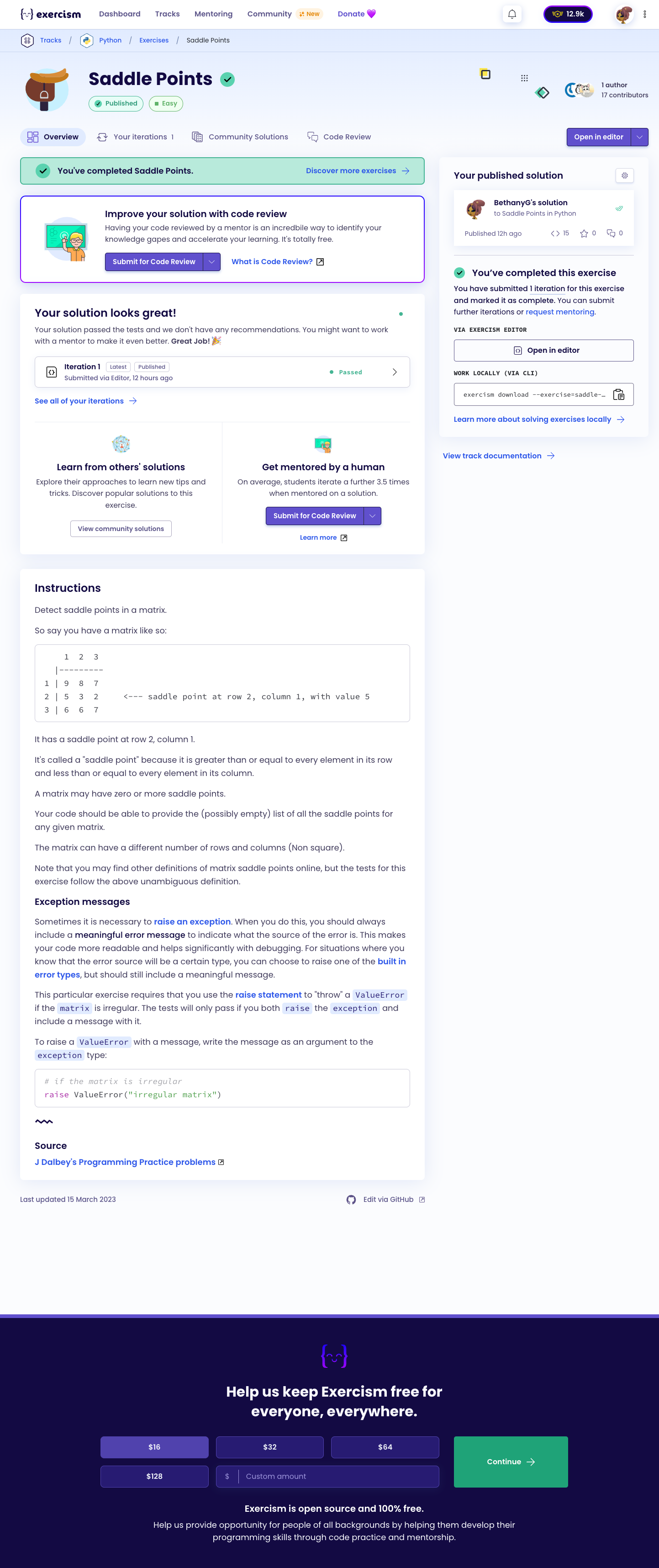
Which page exactly? Can you post a screenshot?
I second the suggestion (possibly Jeremey’s) to have check marks on the Dig Deeper, Community Solutions, and Code Review tabs. I find that kind of thing works really well.
My addition to that suggestion was to have a badge for users who get all tick marks for all their solutions.
Hurray for gamification!
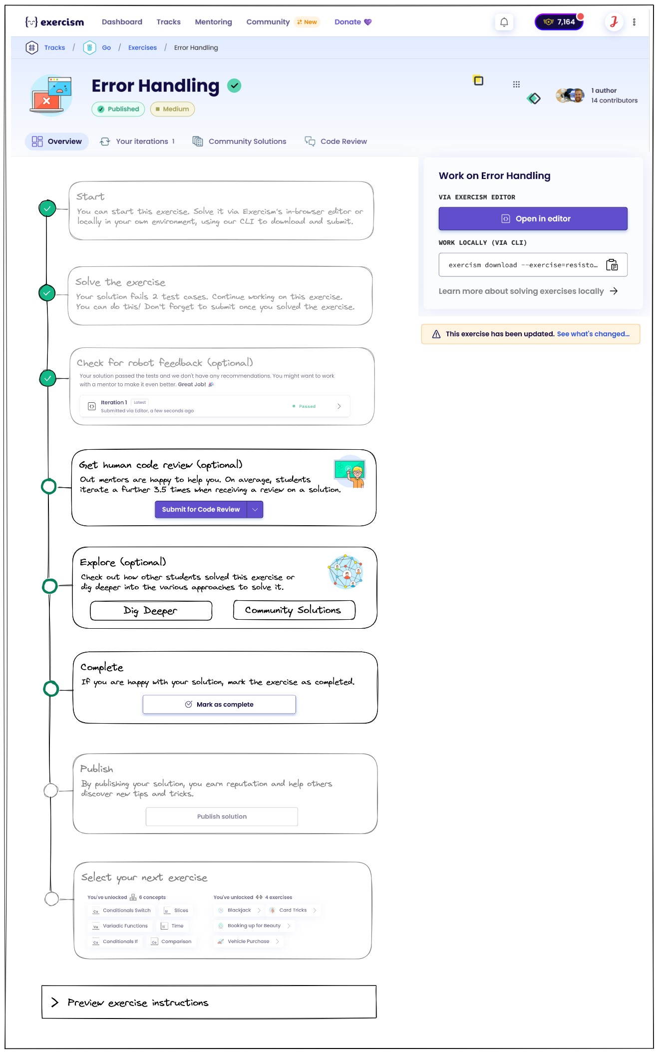
@MatthijsBlom I believe it’s the one below (@jonathanmiddleton correct me if I’m wrong):
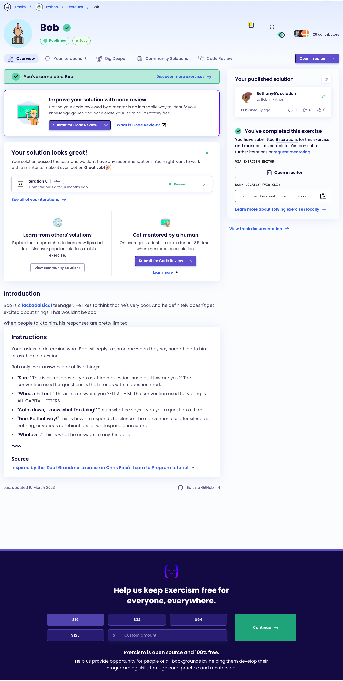
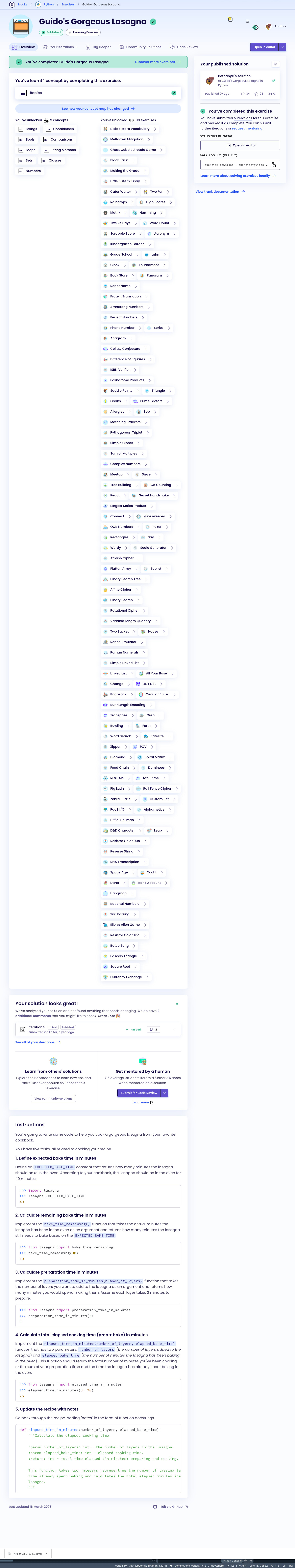
The concept exercise version (at least for Lasagna) for Python is … horrifying:
Cute confetti animation and a little reward sound like on Khan Academy? I know it’s considered bad form for web pages to make noise, but it really is quite satisfying.
1 Like
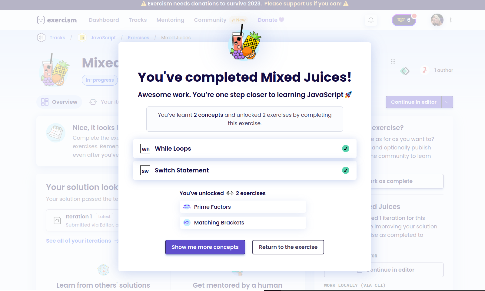
I just finished an exercise and realized that when you submit you get a pop-up that covers up the parts of the page we’re trying to get more engagement with.
The options on the pop-up are go to exercises or return to question. After just finishing an exercise I don’t want to go back to it I want to get to the new stuff.
This popup is likely directing people away from exploring more.
2 Likes
@gelbelle Thank you for posting that popup! I was trying to get a screengrab of it, but couldn’t get it to trigger for me yesterday. I think this modal is where Jeremey was proposing (maybe?) a set of checkboxes or calls to action around things like
- Get a code review
- Explore community solutions
- Dig deeper with approaches
- Look at performance with performance articles
- Talk about it on discord
etc.
The modal looks different for concept exercises vs practice ones. Yours is a concept one, I think the practice one doesn’t include the concept listing, but can’t remember now.
But also good point - it covers the page (although if you click return to the exercise, it goes away and displays the exercise page.)
1 Like
I wonder if the two-part column layout is needed. I am not a UX/UI designer at all, but the second column end after two boxes and if you scroll down, there is a lot of whitespace, which is not cool on specific aspect ratios.
1 Like
It does let you go back. I’m not entirely sure if this is more of a me thing, but once I’ve completed something and been told there are no recommendations I’m eager to move on. I have zero incentive to click go back to exercise. In my mind, I’ve nailed it and it’s time to get the next one.
It would clutter it but maybe suggesting or highlighting dig deeper or community would help.
1 Like
For reference, there was some prioir discussion about this here: Too difficult to follow · Issue #6333 · exercism/exercism · GitHub
When I first interacted with this exercise page before v3 launched officially, it literally took me weeks to understand what this page is about, where which buttons are, when which actions pop up etc. I was always confused an overwhelmed.
Some distinct points that come to mind that confused me:
- Too much change: The whole page changes its layout through the exercise lifecycle, buttons change their text even though they still do the same, boxes in the same place have different text, etc. In an application, you want to get used to where stuff is so you can navigate it quickly and confidently. With this page, this is very hard.
- Duplicated CTAs (call-to-action): There are two buttons to open in editor very close to each other. There is a banner and a box/panel about mentoring very close to each other.
- Too many CTAs: There are at least 3 primary buttons and a lot of secondary buttons and then additionally a lot of very prominant links to additional information.
- Too many banners/callout boxes at the top: Completed banner, request mentoring banner, update exercise banner etc.
(This is not a critique about the work done at the time. I would not have been able to say to improve this back then either. I think we just see the flow more clearly now that we actually had the site in action for while.)
So where to go from here? I think the overall page structure should be rather static and always be clear about the lifecycle of the exercise and where you are in that lifecycle. Not sure if that is what others meant by “checklist” in the community call as well. Bethany also mentioned something along those lines above.
Besides this “lifecycle clarity”, the right sidebar should always be exactly the same, besides potentially sometimes telling you that the exercise needs updating.
Below is a low-fidelity draft of how I could imagine this could be achieved. The first image shows all possible panels just to illustrate the potential content of each of them. In reality, the panels that are not relevant could be “minified” as shown in the second image.
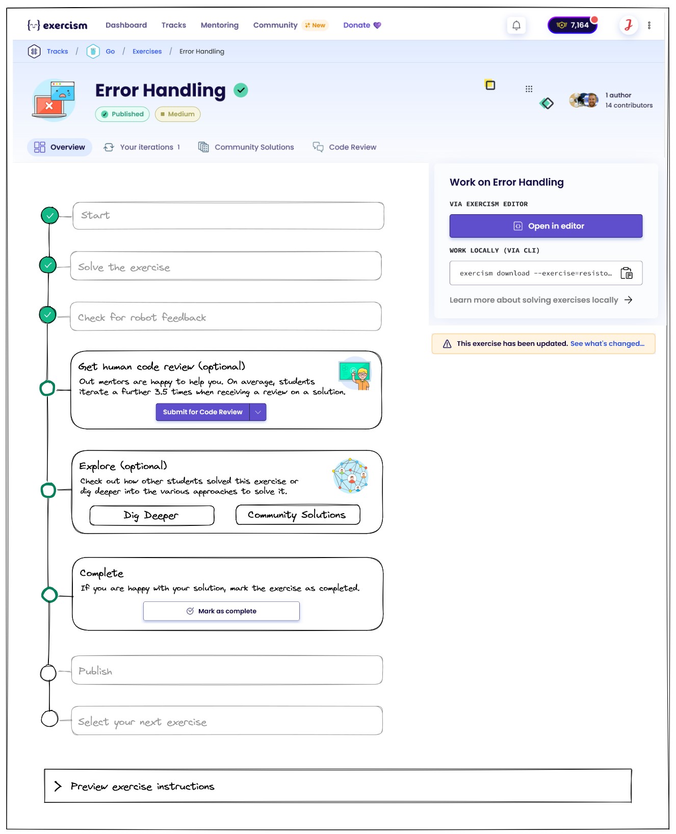
(I am not set on any of the layouts/texts in the images, I just thought putting out some rough visualisation of a “fix” for the page would help the discussion.)
The popup that shows after submitting a solution should be a separate topic and I understood there is already some work in progress to improve that one.
5 Likes
I think it would be good to show students a page / document when they finish a solution.
This page could:
- Discus common pitfalls / code quality issues (that can’t be caught be the analyser)
- Discuss various ways of solving the exercise and the trade offs of each method
- Signpost the exemplar solution
- Signpost interesting community solutions
- Ask you to comment on a couple of existing solutions
- Probably some other stuff
I find it a bit unsatisfying finishing a solution at the moment. Viewing community solutions can be good, but you never quite know if you are seeing a good solution, and you never know if you have seen the full range of possible solutions.
Also, very few community solutions have any comments / ratings / stars at the moment, and I think it would be good to drive more interaction on this.
1 Like
I am a big fan of the flow this layout offers. It makes the progress clear and easy to see. Big fan.
@ceddlyburge What you describe is the idea behind the existing “Dig Deeper” tab of an exercise. In my layout, the “Dig Deeper” button would bring you there.
You can see an example here: Dig Deeper into Bob in F# on Exercism (open in incognito window if it does not show directly when clicking on the link).
It does not cover all the things you mention (yet) but it’s a start in that direction. Of course, not every exercise for every track has one of those pages yet. They are rather new and require some work to create. Mostly mentors help with that.
Thanks June ![]()
I guess what I am proposing is really an extension of the Dig Deeper section. I think I would like it to be free form, so track maintainers can put whatever is relevant in there, but probably also to have a recommended / template layout as a default. And I think I would like it to be part of the exercise, as opposed to an optional thing that you do afterwards. My hunch is that not many students look at community solutions having completed an exercise, which seems like a shame. It’s a missed learning opportunity, and a missed chance for creating some community interaction (nearly none of the solutions have any comments for example).
In my opinion being able to complete an exercise is the easy bit. Completing it idiomatically and in the best way is the hard bit! Especially when you are learning a language.
Cheers Cedd
1 Like
II definitely agree about the community interaction piece. There could be some interesting conversations there.
I read something either here or in Discord the other day and apparently comments are turned off by default.
1 Like