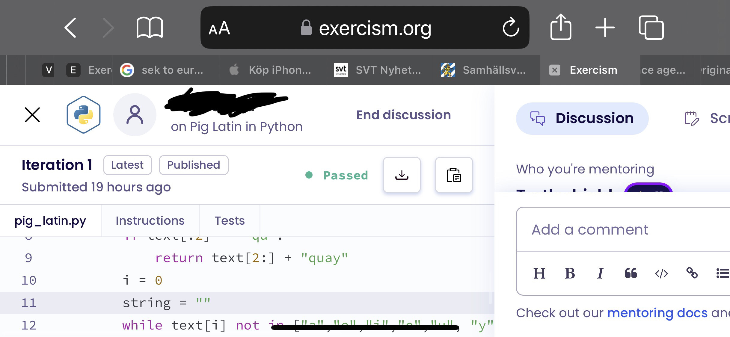
Please can we improve the mobile mentoring experience.
It is almost unusable at the moment.
A simple change of moving the submit button to the left would help.
Currently I have to find a way of putting enough text in my answer to make the button visible.
3 Likes
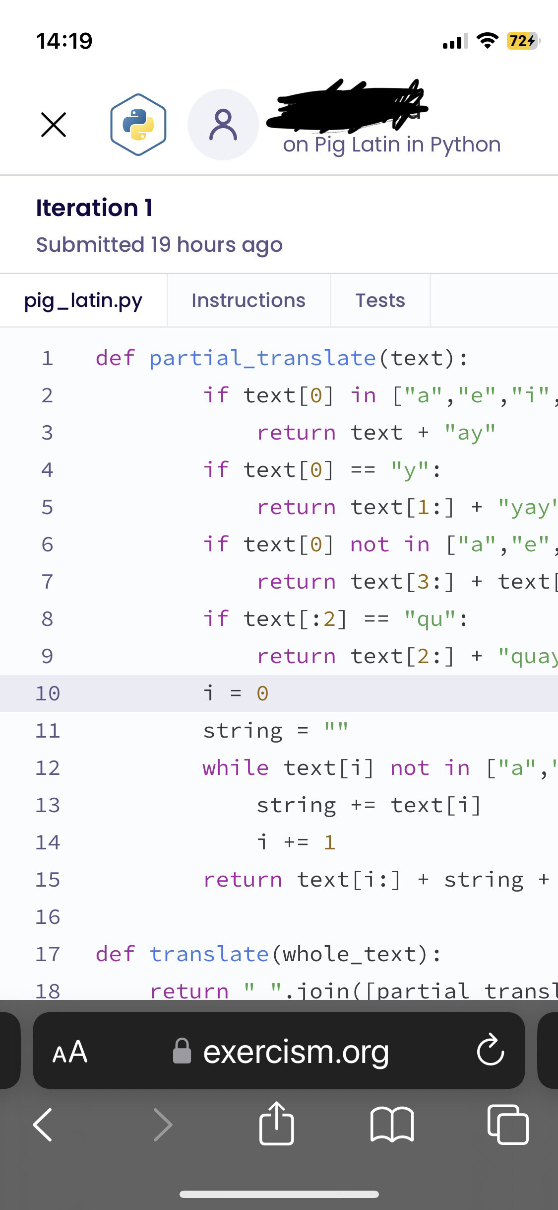
I would call it unusable. I have a smal phone(iphone 12 mini(5.4 inches)). I can’t even see the disscusion messages in landscape mode. I mostly want to use my phone to see what my student replied with. I can decently see the code but the discussion is not in frame(you can see the first few words of each row but I can’t guess the rest 7 words on the row).
On tablet it is better but it is very hard to start writing in the text box although this could be an ios issue.
Thanks for the insight re: mobile accessibility.
@dem4ron @iHiD maybe something to take a look at when there is opporutnity.
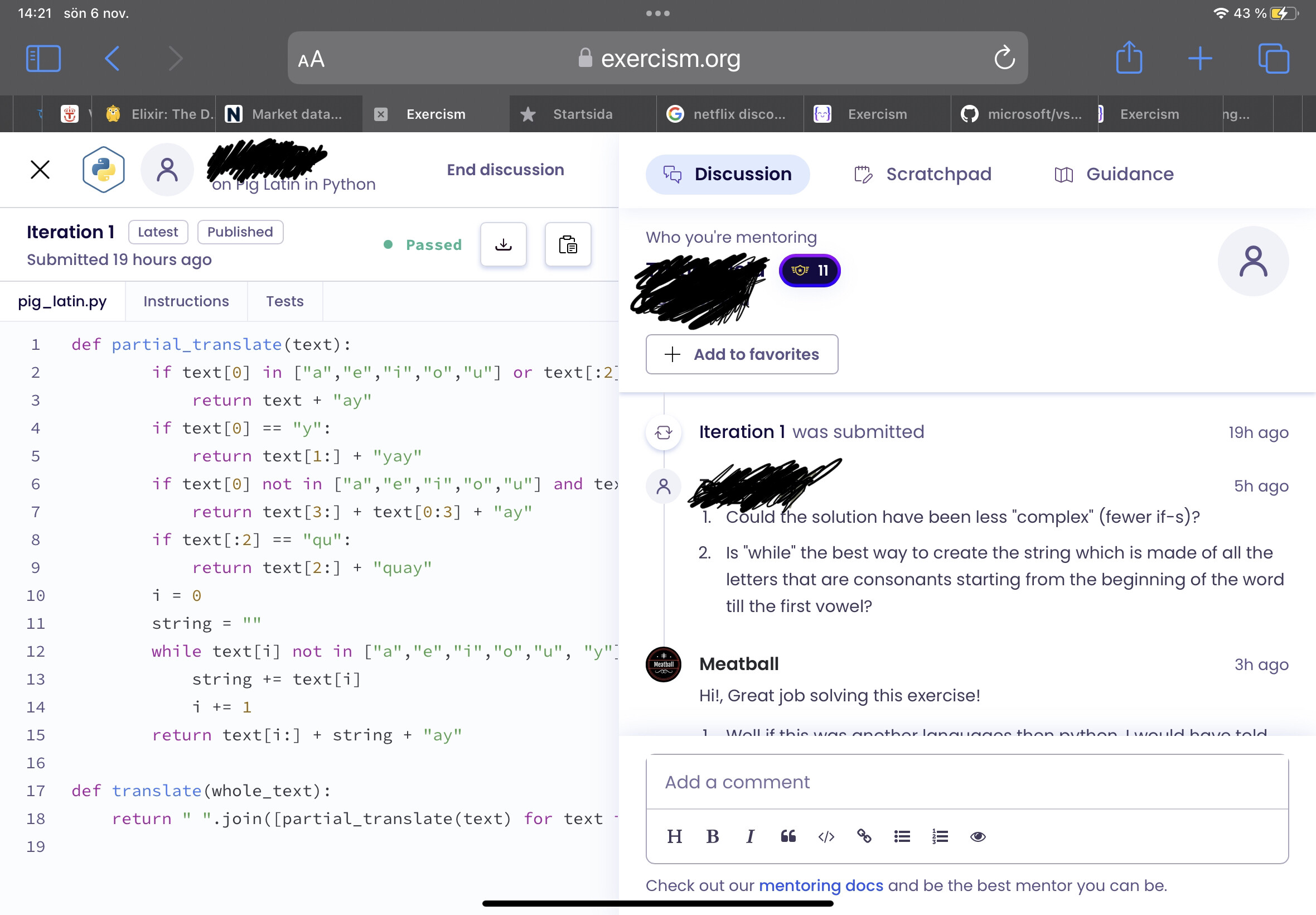
There used to be a setting so community solutions would always be fully expanded rather than having to navigate with scrolling. It would be great if this came back.
1 Like
+1 for this. I have a similar experience as @Meatball described above. I tried turning the phone, enabling desktop mode in the mobile browser etc but nothing makes it usuable. It does not scroll at all most of the time, parts of the page are just not visible. I am totally fine with scrolling a lot, desktop mode or whatever, it would just be great if there was some (potentially ugly) way to use it on mobile at all. Always going back to my PC just to find out the student wrote “thanks” or “I will check it out later” or responding to a quick question was very annoying. Often also my students had to wait for feedback much longer than necessary because I couldn’t answer from my phone.
2 Likes
This continues to be a frustration for me, too. Exercism v2 worked fine on mobile and I often responded to students from my phone. v3 has never worked on mobile and that’s been a well-known and often-remarked-upon issue since at least the beta.
Chris’ suggestion of moving the submit comment button to the left would make the site usable on mobile for me (though the experience would still be poor).
Another easy option would be to set a minimum page width and then we can just scroll horizontally a bit. If that was chosen to prevent the current cropping and overlap issues, that would be a better result for me than moving the submit button.
In the longer term, please change the mentoring discussion page to a one-column layout on narrow screens.
1 Like
Although I don’t think I would use mobile for my first response, it would at least be nice to be able to respond to followup questions, and to give reminders to close the session. But no can do. As auto-correct changed my typo, “mobile” is “My bile”.
2 Likes
On mobile I used the Samsung browser, because I can scale the whole page. With that I can actually see and use the comment section. But still no fun.
On mobile I would expect maybe even two tabs two switch between code and comments.
At least I should be able to reach every area, which is currently not possible.
Ah, my Android is Motorola. Very inexpensive, but can’t scale or scroll.
We’re going to be addressing responsive issues over the next couple of months.
5 Likes
Thanks for reporting, this PR will fix the issue:
2 Likes